Difficulty: Advanced | Time: 60–90 minutes | Steps: 15 | Good for: Teens 13+ and experienced artists
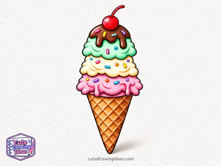
Drawing ice cream is one of my favorite ways to experiment with colors and textures. In this tutorial, I’ll show you how to draw ice cream with three stacked scoops, a detailed waffle cone, melting chocolate, rainbow sprinkles, and a cherry on top.
I’ll start with a light pencil sketch, then build the details before using alcohol markers and colored pencils to add depth. We’ll also work on smooth shading, natural scoop folds, and the crisscross texture that makes a waffle cone stand out.
What You’ll Need to Draw Ice Cream
For this advanced ice cream drawing, I recommend using a combination of sketching pencils, alcohol markers, and colored pencils. Each tool helps create a different part of the illustration.
- Graphite pencils (2H, HB, and 2B): Use a 2H pencil for light guidelines, an HB pencil for refining shapes, and a 2B pencil for darker sketch details where needed.
- Smooth drawing paper (180–250 gsm): Choose heavyweight, bleed-resistant paper suitable for alcohol markers so the colors blend well without excessive bleeding.
- Kneaded and white vinyl erasers: A kneaded eraser helps lighten pencil marks, while a white vinyl eraser removes unwanted guidelines.
- Waterproof fineliners (0.1 mm, 0.3 mm, and 0.5 mm): Use these for fine details, clean outlines, and the waffle cone pattern. Choose ink that’s compatible with alcohol markers.
- Alcohol markers: Prepare strawberry pink, rose pink, vanilla cream, mint green, light tan, golden brown, chocolate brown, cherry red, and warm gray.
- Artist-quality colored pencils: Keep matching shades of pink, green, brown, cream, and red, along with white and dark brown for blending and shadows.
- White gel pen: Use this for the final highlights on the cherry, chocolate syrup, and ice cream scoops.
My tip: I always test markers and fineliners together on a spare piece of paper before starting. This helps me check whether the ink smudges when I add color. I also place a protective sheet underneath when working with alcohol markers.
How to Draw Ice Cream Step by Step
Step 1: Sketch the Basic Ice Cream Shape
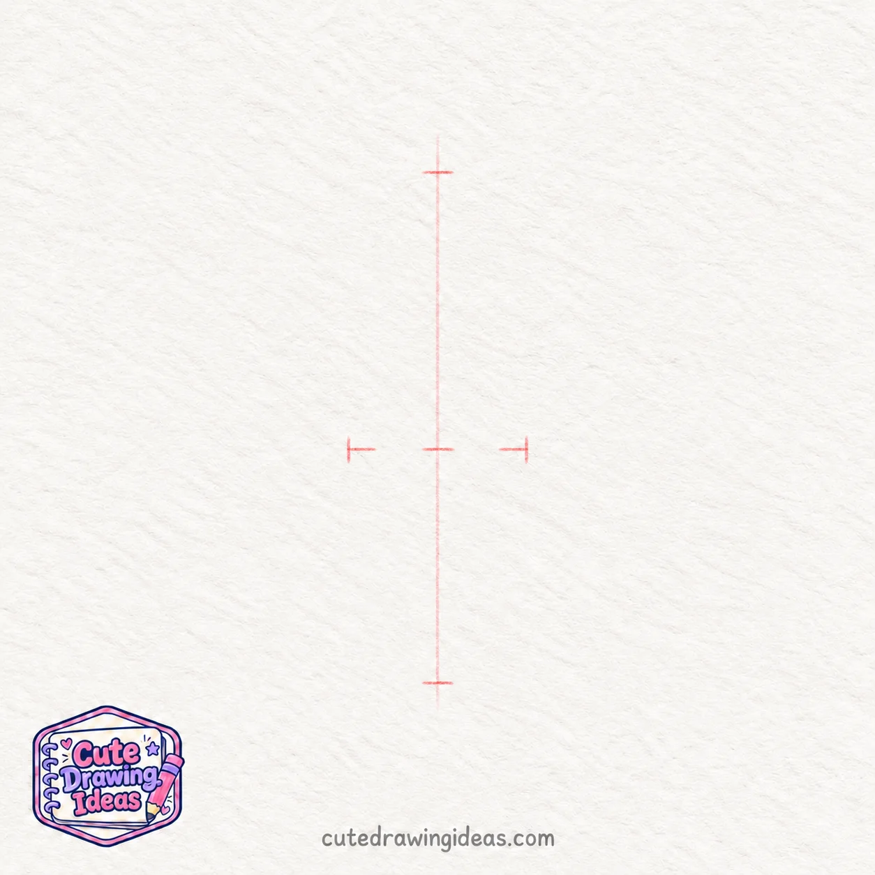
I begin with a 2H pencil and a very light vertical guideline down the center of my paper. This helps me position the three ice cream scoops above the cone without making the drawing lean too far to either side.
Next, I mark three points along the guideline: the top where the cherry will sit, the place where the bottom scoop will meet the cone, and the lowest point of the cone. I leave a little space above and below the drawing.
I keep slightly more than half of the total drawing height for the three scoops and cherry, leaving the remaining space for the cone. Then I add two small marks on either side of the centerline to guide the width of the bottom scoop.
I keep all these lines faint because they’re only guidelines. Once I’m happy with the proportions, I’m ready to draw the cone outline in the next step.
Step 2: Draw the Waffle Cone Outline

Using my HB pencil, I start just below the two width marks from Step 1. I draw a long, slightly curved line from the left mark down to the bottom point of the vertical guideline. Then I repeat this on the right side, bringing both lines together to form a narrow, rounded tip.
Next, I draw a shallow curved line between the two upper ends to create the cone’s opening. I make the curve dip slightly in the middle to give the rim a rounded appearance.
I keep the cone’s sides smooth and slightly tapered, making sure both edges meet neatly at the bottom. I leave the waffle pattern for a later step.
Step 3: Draw the Bottom Ice Cream Scoop

Using my HB pencil, I start near the left corner of the cone’s opening and draw a wide, rounded curve that rises above the rim. I bring the curve across the top and down toward the right side, making the scoop slightly wider than the cone.
Next, I add small, uneven curves along the bottom edge of the scoop, letting a few extend just below the cone’s rim. These soft, wavy edges make the ice cream look naturally scooped rather than perfectly round.
I keep the scoop centered over the cone and leave its surface blank for the folds and shading we’ll add later.
Step 4: Draw the Middle Ice Cream Scoop

Using my HB pencil, I start near the upper-left side of the bottom scoop and draw a rounded curve that rises above it. I carry the curve across the top and bring it down toward the right, making this second scoop slightly smaller and placing it a little to the left of the first one.
Next, I add a few small, uneven curves along the lower edge where the middle scoop overlaps the bottom one. I make some curves wider than others to give the ice cream a soft, natural shape.
I keep the overlapping edges clear so both scoops look separate, leaving the smaller folds and melting details for a later step.
Step 5: Draw the Top Ice Cream Scoop
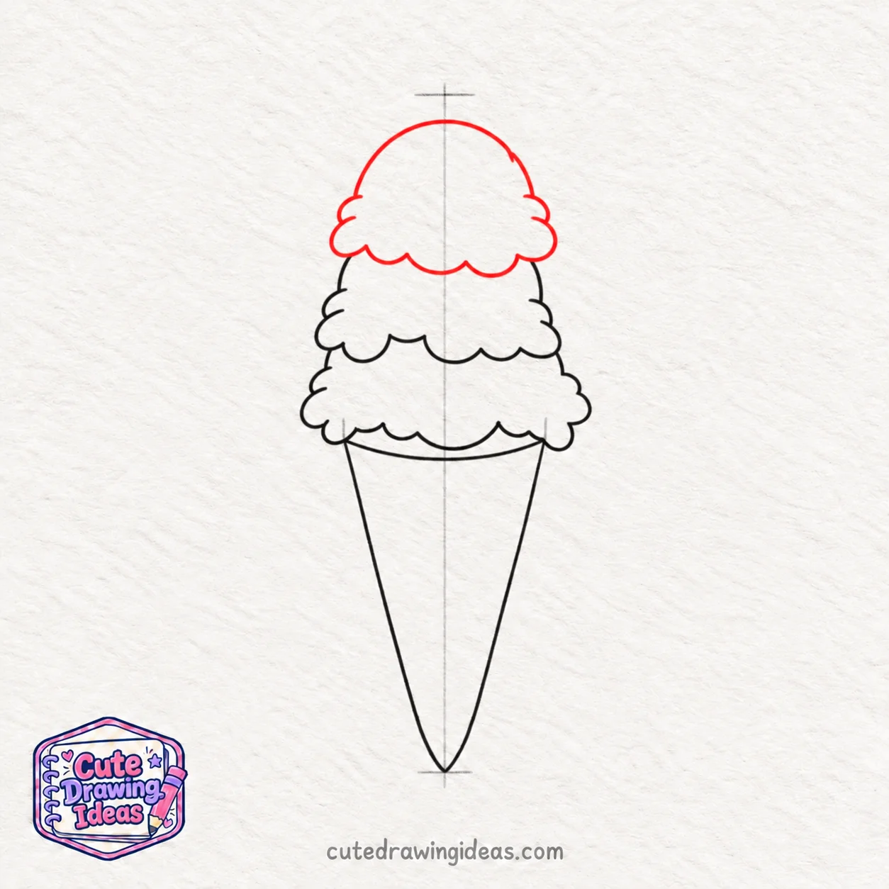
Using my HB pencil, I start just above the left side of the middle scoop and draw a rounded curve that rises toward the top guideline. I bring the curve over to the right, making this third scoop slightly smaller and shifting it a little to the right of the middle one.
Next, I draw a wavy lower edge with a few small, uneven bumps where the top scoop rests on the middle scoop. I let the edges overlap slightly to make the stack look natural.
I check that all three scoops look balanced above the cone and leave a little space at the top for the cherry we’ll add later.
Step 6: Add Curves, Folds, and Melting Details

Using my HB pencil, I begin adding texture to the three ice cream scoops. On the top scoop, I draw two short, curved lines near the lower edges, following its rounded shape.
Next, I add a few gentle folds to the middle and bottom scoops, placing them just above the wavy edges. I make some lines shorter and slightly deeper than others to give the ice cream a soft, creamy appearance.
To show a little melting, I draw two small, rounded drip shapes along the lower edge of the bottom scoop, with their curved ends pointing downward toward the cone.
I keep the details light and spaced apart so the scoops don’t look crowded. These small folds will also help me decide where to add shadows when I start coloring.
Step 7: Draw the Chocolate Syrup and Drips
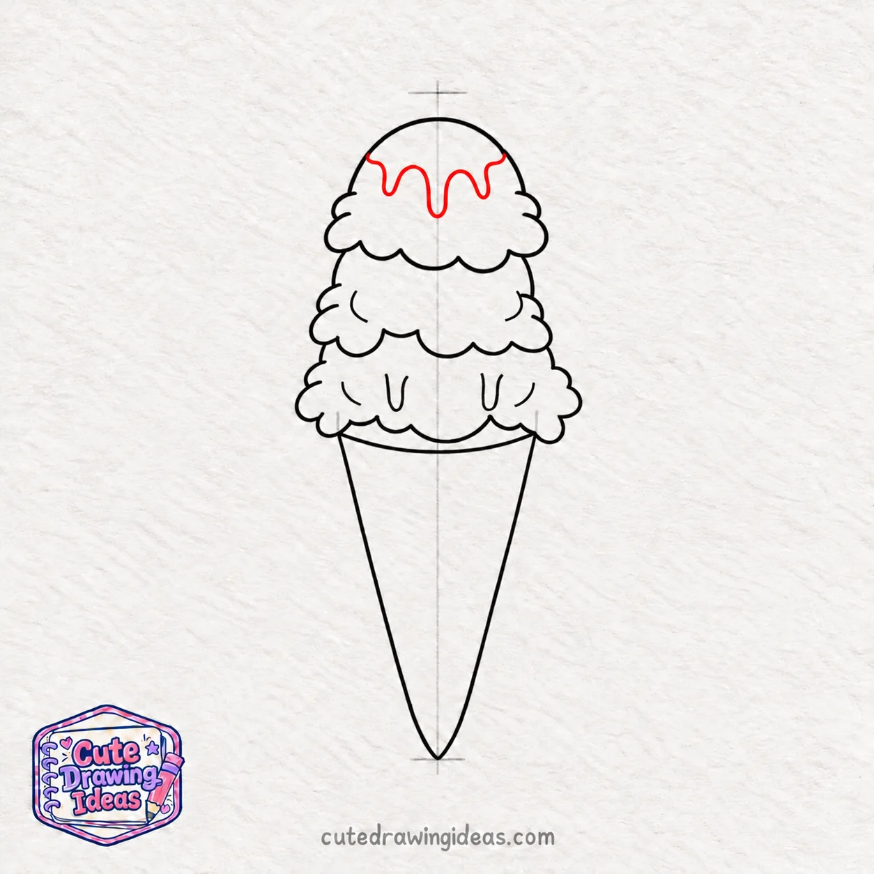
Using my HB pencil, I start near the upper-left edge of the top ice cream scoop and draw a gently wavy line across its front to create the lower edge of the chocolate syrup.
As I move toward the right, I extend the line downward in three places to form melting chocolate drips. I give each drip a rounded bottom, making one longer and the others shorter so the syrup looks like it’s flowing naturally.
I connect the drips with small, curved lines and finish at the right edge of the scoop. I keep the syrup within the scoop’s outer outline and leave the very top clear for the cherry we’ll draw next.
Step 8: Add the Cherry and Colorful Sprinkles

Using my HB pencil, I draw a small, round cherry at the very top of the ice cream, letting its lower edge overlap the top scoop slightly. I add a thin stem that curves upward and bends gently to the right.
Next, I scatter small sprinkles across the three ice cream scoops. I use short, rounded rectangles and tiny oval shapes, tilting them in different directions to make the toppings look naturally scattered.
I add a few sprinkles over the chocolate syrup, leaving enough space between them so the dripping chocolate and curved scoop details remain visible. I keep the shapes small and clear because I’ll color them with bright shades later.
Step 9: Create the Waffle Cone Pattern
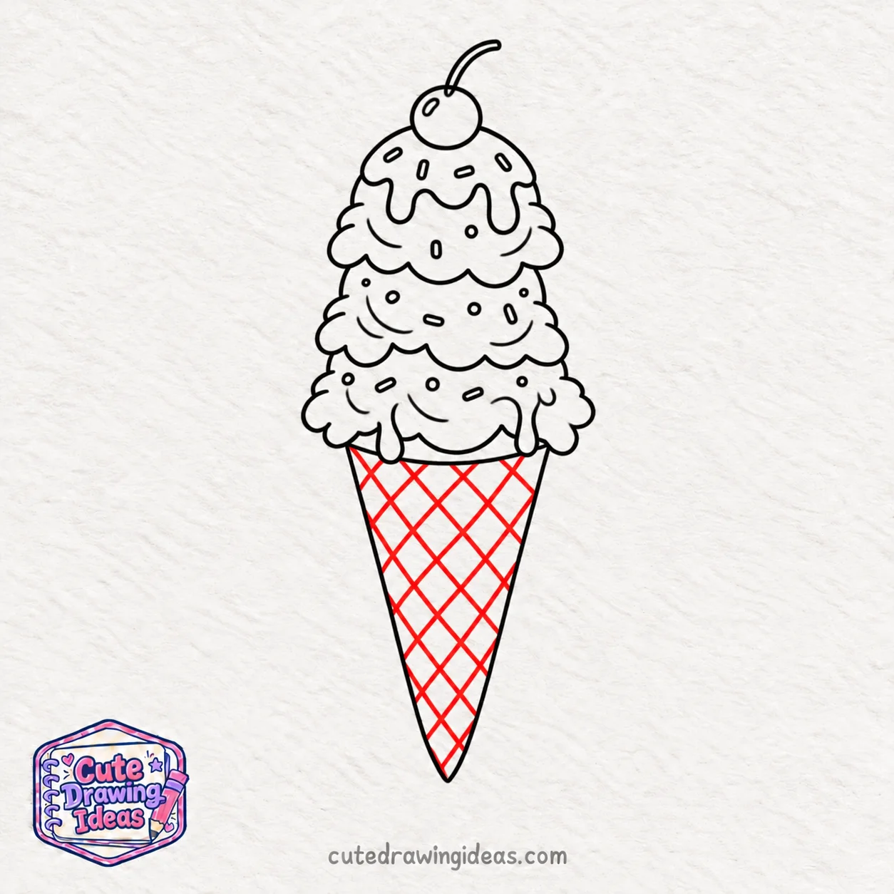
Using my HB pencil, I draw a series of evenly spaced diagonal lines across the waffle cone, starting near the top-left edge and slanting downward toward the right. I follow the cone’s tapered shape, making the lines shorter as I move toward the pointed tip.
Next, I draw another set of diagonal lines in the opposite direction, crossing the first set to create a diamond-shaped waffle pattern.
I curve the lines slightly to follow the cone’s rounded surface and keep the diamonds smaller near the bottom. This gives the waffle cone a more natural, three-dimensional appearance. I leave the spaces between the lines clear for the shading and golden-brown colors I’ll add later.
Step 10: Refine the Outlines with Fineliners
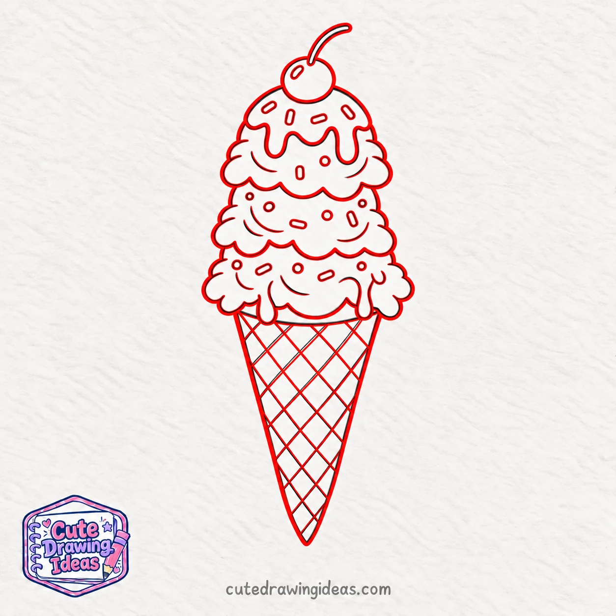
Now I switch to my 0.3 mm waterproof fineliner and carefully trace the outlines of the three ice cream scoops, chocolate drips, cherry, and cone. I follow the pencil sketch without changing the shapes we’ve already drawn.
Next, I use a 0.1 mm fineliner to trace the smaller details, including the sprinkles, scoop folds, and diamond-shaped waffle pattern. I keep these lines thin so the textures remain clear.
For extra depth, I use a 0.5 mm fineliner to slightly thicken the outer edges of the scoops and the cone. Once the ink is completely dry, I gently erase the remaining pencil guidelines, leaving a clean outline ready for coloring.
Step 11: Apply the Base Colors to the Ice Cream

Now I switch to my alcohol markers to bring some color into the drawing. I start with a light strawberry pink marker for the bottom scoop, vanilla cream for the middle scoop, and soft mint green for the top scoop. I fill each section evenly, following the curved edges and leaving a few small white spaces for highlights.
Next, I color the waffle cone with a light tan marker, carefully working around the diamond-shaped pattern. I use chocolate brown for the syrup on the top scoop and cherry red for the cherry, keeping its small highlight uncolored.
I leave the sprinkles white for now so I can give them different colors later. I also avoid adding darker shades at this stage because I’ll build the shadows and depth in the next step.
Step 12: Shade the Ice Cream Scoops
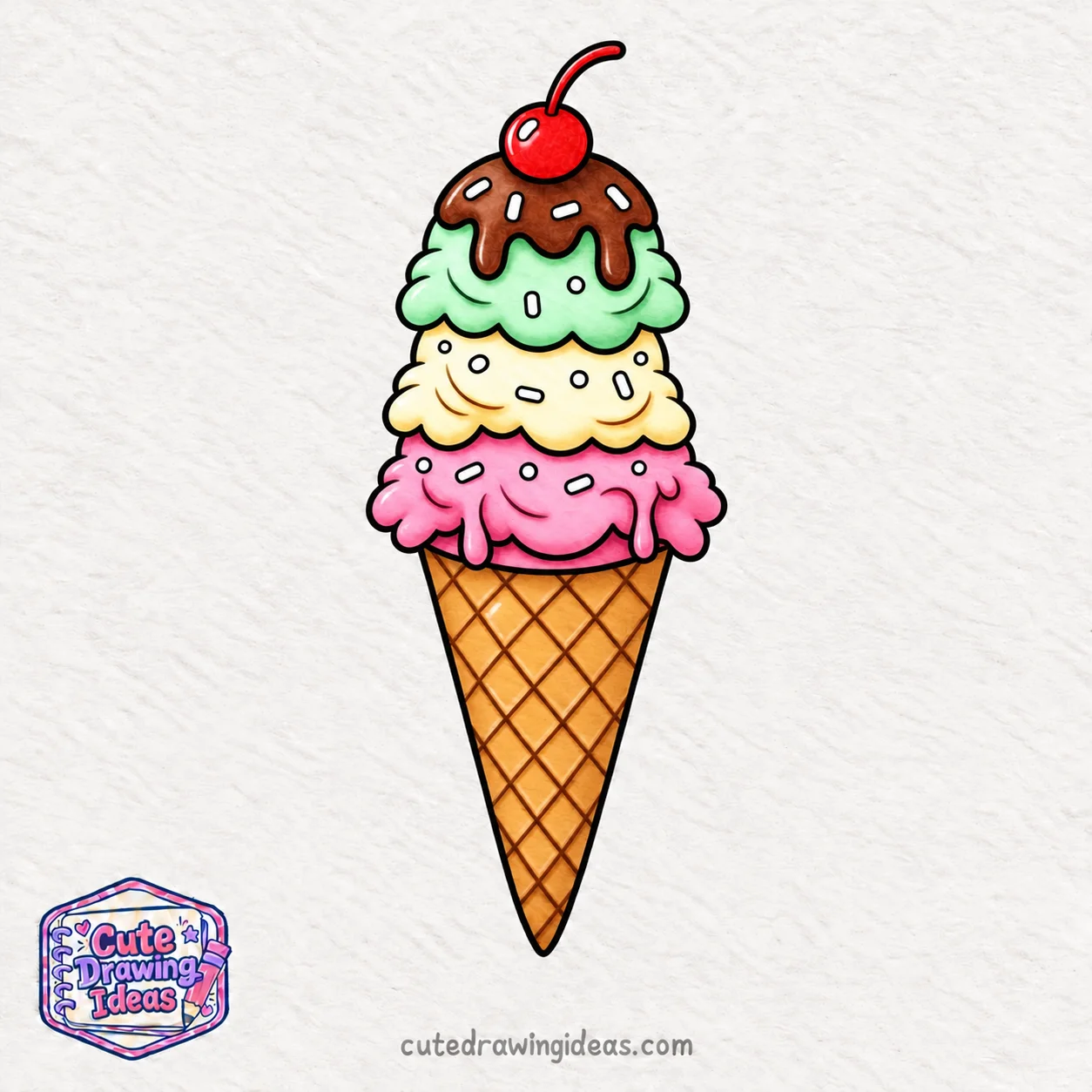
Now I use darker alcohol markers to add depth to the three ice cream scoops. I imagine the light coming from the upper-left side, so I’ll keep those areas lighter and place the shadows toward the lower-right.
I start with a darker pink marker on the bottom strawberry scoop, adding soft shadows beneath its wavy edges and around the melting drips. Next, I use a warm cream shade on the middle vanilla scoop, darkening the areas where it overlaps the strawberry scoop.
For the top scoop, I use a slightly darker mint green marker to shade the lower edges and the areas beneath the chocolate syrup. I follow the rounded curves of each scoop rather than drawing straight patches of color.
Before the ink dries completely, I blend the darker areas into the lighter base colors using the original markers. I leave the upper-left portions bright to give all three scoops a soft, rounded appearance.
Step 13: Add Depth to the Waffle Cone

Now I focus on making the waffle cone look more textured. Using a golden-brown alcohol marker, I gently darken the right side of the cone and the area just beneath the bottom ice cream scoop.
Next, I use a dark brown colored pencil to shade along the diagonal lines of the waffle pattern. I add slightly darker strokes to the lower-right edges of the diamond shapes, making them look raised rather than flat.
I keep the centers of the diamonds lighter to show the golden, baked surface of the cone. Near the pointed tip, I gradually deepen the brown shading to create more depth.
Finally, I blend the darker areas with a light tan colored pencil, keeping the waffle pattern clearly visible.
Step 14: Blend Colors and Refine the Toppings

Now I use my colored pencils to smooth out the shading and add finer details. I start with a rose-pink pencil on the strawberry scoop, a warm yellow pencil on the vanilla scoop, and a darker green pencil on the mint scoop. I gently blend the shaded areas into the lighter colors using small, circular strokes.
Next, I take a dark-brown pencil and deepen the shadows along the chocolate syrup, especially beneath the rounded drips. I also add a little darker red to the lower-right side of the cherry to make it look rounder.
For the sprinkles, I use bright pink, blue, yellow, purple, and orange pencils, carefully filling each small shape without covering its black outline.
I finish by adding a few soft shadows around the sprinkles and curved folds, keeping the lighter areas visible for the final highlights.
Step 15: Add Highlights and Finish the Ice Cream Drawing
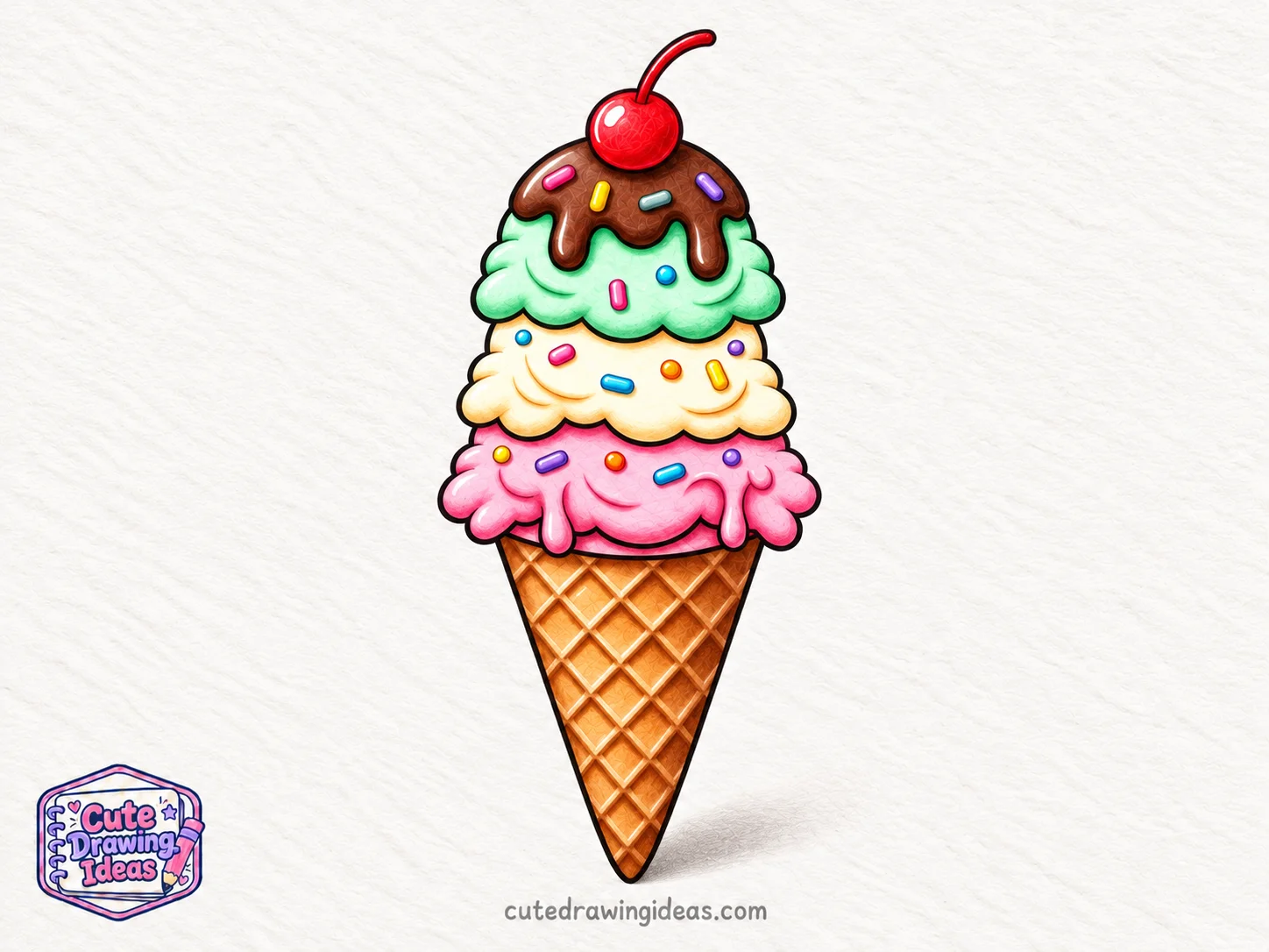
For the final step, I use my white gel pen to add small highlights to the upper-left curves of each ice cream scoop. I also draw a few thin shine marks on the chocolate syrup and brighten the highlight on the cherry to give it a glossy finish.
Next, I use my dark brown colored pencil to strengthen the shadows beneath the overlapping scoops and around the waffle cone’s edges. I keep the shading soft so the colors blend naturally without covering the smaller details.
Then I take a warm-gray colored pencil and add a faint cast shadow on the paper just to the lower-right of the cone, keeping it soft and close to the pointed tip.
Finally, I check the sprinkles, scoop folds, and waffle pattern for any uneven coloring. With the last highlights in place, my triple-scoop ice cream drawing is complete!
Tips for Making Your Ice Cream Drawing Look More Realistic
How to Make Ice Cream Scoops Look Round
When I draw rounded scoops, I pay attention to how the curved surfaces face the light. The top of a scoop usually needs a smoother color transition than the folded edges underneath.
If a scoop looks flat, I work a little more color into the sides rather than adding extra outline lines. I also avoid making every fold equally dark, since some curves should appear softer and shallower than others.
How to Make Waffle Cone Texture Stand Out
The waffle pattern becomes more convincing when the diamond shapes follow the cone’s taper instead of looking like a flat grid.
I also vary the pressure of my colored pencil. A little extra brown where two waffle lines cross helps the grooves appear deeper, while lighter strokes on the raised surfaces keep the texture from looking too heavy.
How to Blend Markers and Colored Pencils
I find that colored pencils work best over alcohol markers once the marker ink has dried completely. If I try to add pencil details too early, the paper can become difficult to work with.
I use light pencil pressure at first and build the color slowly. If a marker transition looks too sharp, I soften it with several gentle pencil strokes rather than pressing hard in one place.
Common Mistakes to Avoid
Even a carefully drawn ice cream cone can look unbalanced if a few details aren’t placed correctly.
- Making the scoops too similar: If all three scoops have identical outlines, the stack can look stiff. I vary their width and the shape of their lower edges.
- Adding too many texture lines: Too many folds can make the ice cream appear wrinkled. I remove unnecessary pencil marks before inking.
- Drawing an uneven cone pattern: If the waffle diamonds become crowded near the tip, I lightly redraw their spacing before tracing them with a fineliner.
- Overworking the paper with markers: Repeatedly coloring the same area can cause bleeding or patchy results. I let the ink settle before deciding whether another layer is necessary.
- Using inconsistent lighting: If the shadows and highlights appear on random sides, the drawing loses depth. I check that the strongest highlights face the same light source.
Why I Love Drawing Ice Cream
What I enjoy most about drawing ice cream is the contrast between its soft, uneven scoops and the neat diamond pattern of the waffle cone.
The scoops give me room to practice smooth blending and curved shading, while the cone requires more careful linework. I also like how the chocolate drips break up the rounded shapes without making the drawing too complicated.
My favorite detail is the cherry on top. It’s small, but its rich red color adds a lovely finishing touch to the entire illustration.
Fun Facts About Ice Cream
Here are a few things about ice cream that I find interesting, especially when I’m drawing different frozen desserts.
- Waffle cones are rolled while they’re still warm.
A waffle cone begins as a thin, baked round. It’s shaped into a cone before it cools and becomes firm. The textured surface is what gives us those recognizable waffle patterns to draw.
- Ice cream contains tiny pockets of air.
Air gets mixed into ice cream during the freezing process, helping create its soft texture. That’s one reason I prefer gentle color transitions when drawing creamy scoops instead of rough, heavy shading.
- Soft serve has a different texture from regular scooped ice cream.
Soft serve is generally served at a warmer temperature than hard ice cream, so it holds a softer shape. Its familiar spiral also makes it an interesting subject for a different style of dessert drawing.
Fun Ice Cream Drawing Variations
Once I’ve finished the triple-scoop cone, I like trying other dessert shapes that use some of the same drawing techniques.
Ice Cream Sundae Drawing
For an ice cream sundae, I replace the pointed cone with a wide dessert glass or a rounded bowl.
I draw two overlapping scoops inside the glass, then add a whipped cream swirl, chocolate sauce, and a cherry. A transparent glass is an extra challenge because I need to show its curved edges and the ice cream visible through it.
Ice Cream Sandwich Drawing
An ice cream sandwich has a completely different shape from a tall cone.
I start with two thick, rounded rectangular cookies and draw a layer of ice cream between them. I add tiny dots and uneven edges to the cookies, then use shading to separate the darker baked surfaces from the creamy filling.
Soft Serve Ice Cream Drawing
Instead of stacked round scoops, I draw a tall spiral that gradually becomes narrower toward the top.
I use curved bands to show each layer of soft serve, making sure the lower swirls are wider than the upper ones. Shading beneath each band creates the appearance of overlapping folds.
I can finish this version with a smaller sugar cone and a few chocolate sprinkles.
Cute Kawaii Ice Cream Drawing
For a cute kawaii ice cream drawing, I turn the dessert into a little character.
I draw two small oval eyes and a smiling mouth on the front of the bottom scoop. Then I add rosy cheeks and tiny arms extending from the sides.
I keep the facial features away from the melting drips so the expression stays clear. This creates a different character-style illustration while keeping the detailed coloring and waffle texture.
Frequently Asked Questions
Can I draw ice cream without alcohol markers?
Yes. Colored pencils can create the entire drawing. I would start with light layers of color, gradually increase the pressure for darker areas, and use a white pencil or gel pen for the highlights. The blending takes more time, but it gives me greater control over smaller details.
How can I stop my ice cream drawing from looking flat?
I check where the scoops overlap and whether the shadows match the light source. If the shapes still look flat, I deepen the shadows in the narrow gaps between scoops while keeping their upper surfaces lighter.
How do I draw melting ice cream without making it messy?
I draw a few rounded drips of different lengths instead of covering every edge with melting shapes. I also keep the drips connected to the scoop or syrup they belong to, so they look like part of the dessert rather than separate decorations.
What is the easiest type of ice cream to draw?
A single-scoop ice cream cone is a good starting point because it has fewer overlapping shapes. Once I’m comfortable drawing one rounded scoop and a tapered cone, I can add more scoops, toppings, and detailed shading.
Keep Drawing!
I hope you enjoyed creating this colorful ice cream drawing with me! My favorite part is seeing how the small folds, waffle texture, and layered colors come together in the finished illustration.
For another drawing challenge, try creating a soft-serve cone using the curved shading techniques we’ve practiced. You can give it a completely different shape while keeping the same hand-drawn style.
